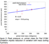
This is the figure from the article which depicts the effect of primer weight on Peak Blast pressure. Frequently there are statements about statistical significance; using this as an example I will attempt to elaborate upon what are often misleading interpretations.
View attachment 1053602
First of all your general impression is that there is some degree of cause-effect whereby higher primer mass leads to higher pressure. Secondly the scatter of the individual data points makes one question the effectiveness of sorting; for example fours shots with weight around 353 exhibited a pressure range of about 375-425, which is nearly the entire range across all the primer weights. But the common perception is that the correlation coefficient r=0.57 is "good". What does all this mean? A few highlights follow, and most if not all of these factors can be determined using Excel vs a statistical package.
Points:
a. Variability of the pressure is SD=30.9. The effort of the regression analysis is to explain as much of this SD as possible, using the simplest mathematical expression possible. While attempting to explain this with primer mass, the other implied aspects is that there is error involved measuring pressure and primer weight.
b. Is the correlation significantly significant? The correlation coefficient 0.57 means 0.57**2 = 30% r-squared of the pressure variability can be explained with this model. Additional parameters show there is a 93% chance this is significant.
c. But what about the scatter? The difference between measured pressure and that which is predicted by the regression line (residual = actual - predicted) has SD = 27.3, which provides information as to how well you will be able to predict pressure based on primer weight. In this case the SD of the error (27.3) is high vs the total pressure variability we started with (30.9).
d. How effective is sorting? Statistical packages such as Minitab include the ability to calculate another correlation coefficient r(predicted). This involves dropping an observation, calculating the predicted value of that observation using the remaining data, and then comparing that prediction to the actual; repeat for every observation. In this case r-squared(predicted) = 0.0%, meaning using weight to sort for pressure is completely ineffective.
So while there is a statistically significant correlation between weight and pressure, the lack-of-fit is so bad that it cannot be effectively used as a predictor. Why? Don't know exactly because what is lacking is information regarding the reproducability (precision) of pressure measurements and weighing, so we cannot begin to decifer whether the poor correlation is due to inaccuracies of one or both of these measurements, or if other significant factors are involved. The best correlation we could expect is that the SD of the residuals = SD of the precision of pressure measurement (unknown); which is another example of why just looking at the correlation coefficient "r" is a limited perspective.
So much for the lesson in statistics. The main point is that the original visual perspective of the graph is correct, some cause-effect going on but too much scatter to be useful. Don't always be swayed by analysis that contradict your common sense.


") .
.