View attachment 1070847
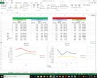
That's the first data set, presented as a scatter plot. Error bars on the average represent 2SD either way, capturing 95% IF it is gaussian. That's a difficult data set to make statistical predictions from. The overlap in error is huge. 1SD, 10fps, is a weight change of 0.04 gns or ~30% of full scale.
You don't (or at least shouldn't) use regression analysis for categorical variables, so why plot it that way?
And you didn't plot the most recent dataset. Why not? Is it because the means are 2-3 standard deviations apart (which is why the t-test is significant at p~0.01)?


